Yettel Self-service
App & web platform | 2025


I worked as a product designer as part of a cross-functional team, collaborating closely with the design lead, product manager, research, development, and business stakeholders. My role focused on translating research and business requirements into clear UX flows and detailed UI screens across app and web, covering key self-service journeys from product discovery and purchase to account and service management. I also contributed to the design language, concept validation, and detailed design decisions that shaped the
final experience.
SCOPE
Discovery & Research, Journey Mapping, Concept Design, Detailed Design, Design System, Usability Testing
SKILS
Product & Strategy, UX & Research, UI & Interaction Design, Handoff & Delivery, Prototyping, Design System
MY CONTRIBUTION
BACKGROUND
Yettel is part of e&PPF Telecom Group and operates in the Bulgarian market as a major telecommunications provider, with a strong focus on digital customer experience and self-service. The company aimed to strengthen its digital channel and make the mobile app the primary place for customers to manage their services.
The project focused on improving the self-service experience across the mobile app and web platform, with the goal of increasing digital adoption, reducing friction, and creating a clearer and more trustworthy experience. The Experience discovery phase identified the main barriers to app usage and defined UX directions that connected customer needs with business goals, forming the basis for design principles, concept development, and detailed design.


THE PROBLEM
In the Bulgarian market, a significant share of customer actions still relies on in-store habits: people are used to buying physical products in a store and paying in cash. When the digital experience does not create a strong sense of confidence, clarity, and added value, the shift toward a “digital-first” primary channel does not happen naturally, even when a digital solution exists.
The higher the perceived risk of the action (for example, purchasing a physical product or making a financial decision), the more sensitive users become: they double-check, hesitate, and struggle to justify using the app if it does not add real value or does not feel trustworthy enough.
The challenge was to make the digital channel, and especially the mobile app, a place where customers can complete actions with confidence, understand what they are getting, and feel there is real value in using the app.

RESEARCH
The research phase established the foundation for the UX decisions that followed. We looked at the customer experience as a whole - across digital touchpoints, as well as the habits and expectations shaped by the physical channel - to identify friction points, test assumptions, and uncover opportunities for improvement. The insights were then synthesized into clear directions that informed the design principles, concept, and detailed design.
UX APPROACH
Turning insights into principles
The research showed a consistent pattern: customers can start digitally, but completion depends on clarity, confidence, and a journey that stays end-to-end. We distilled the findings into four principles that guided both the concept and the detailed design.

Simplified experience
Reduce steps and friction so key flows feel straightforward from start to finish, with fewer dead ends and fewer reasons to drop.

Trust through transparency
Make costs, terms, and changes easy to understand upfront, using clear explanations and safeguards that reduce fear
of surprises.

Support decision-making
Help customers choose with clear comparisons, smart defaults, and contextual guidance when they need to commit,
not just browse.
.png)
Proactive visibility
Surface what is not BAU with clear, timely cues (for example overdue bills, open orders, service issues), so customers feel in control without needing to chase information.
EXPERIENCE CONCEPT
After 9 weeks of research, we moved into a concept phase to translate the findings into a concrete end-to-end experience, addressing both business goals and key customer pain points.
The concept brought the research to life through a “sunny day” scenario, navigation patterns, and key interactions, aligned with the new design system.
It served as a visual baseline to validate direction, gather requirements, and prepare for detailed design, demonstrating an end-to-end commerce journey

Concept validation
The concept helped us test whether customers could complete a full digital purchase journey with enough clarity, confidence, and information to make decisions along the way.
We looked for moments of confusion, checked where information was still missing, and identified parts of the experience worth keeping. Six customers were asked to buy a new device with a plan through the app, from device selection to checkout.
The journey was completed successfully and described as clear, guided, and seamless, but the test also revealed where confidence still depended on details: pricing, contract terms, VAT, and what was included before committing.
These findings shaped the detailed design across the gallery, device details, cart, and order review.
6 participants · 100% completed the flow · 4.83/5 satisfaction · 4.83/5 ease of buying · 4.5/5 information sufficiency
DETAILED DESIGN
We translated the concept into fully resolved, end-to-end screens and interactions.
The solution was defined as a multi-channel experience across app and web, with hierarchy and behavior adapted to different usage contexts.
We iterated in short cycles with frequent walkthroughs and fast alignment with development and legal, proposing practical options on the spot when constraints conflicted, and staying close to business stakeholders to balance feasibility, regulatory requirements, and conversion goals.
The phase included:
Rainy day scenarios and edge cases
Error handling
System states
Micro-interactions
Cross-channel consistency

Primary demonstration flow
This is a high-commitment digital purchase scenario: the customer selects a device and adds a new line in a self-service flow, making decisions about the offer, terms, and final confirmation.
In self-service, these moments tend to carry higher emotional weight (money, commitment, and fear of surprises later), which is why this flow is a strong lens for the experience. It shows how well the digital journey can replace in-store reassurance through clarity, transparency, and guidance, and stay continuous through confirmation and beyond (for example order tracking and management).
An existing postpaid customer purchases a new MBB line with a device via self-service.
Start
Purchase intent
Device & plan selection
Add-ons
Cart summary
Login / verification
Contact details & risk assessment
SIM type & number (physical SIM / eSIM)
Order summary
Contract review & signing
Payment (incl. retry / recovery)
Delivery / pickup
Submit order
Confirmation
Fulfillment & activation (incl. order tracking)
End
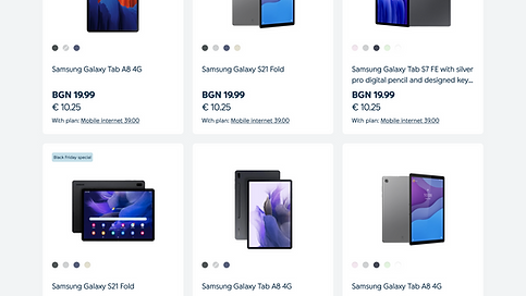
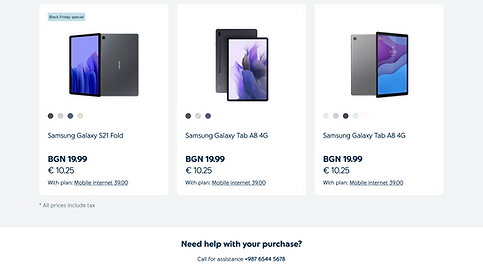
Catalogue and browsing
The entry point is designed to be scannable and decision-friendly, so customers can quickly narrow options and move forward with confidence. The catalogue view supports fast exploration without overload: key comparison cues are visible at a glance, decision-critical information is surfaced first, and secondary details remain accessible without breaking the browsing flow.
Support decision-making
Simplified experience


Device details: decision moments
This screen brings customers closer to commitment, shifting from exploration to concrete configuration and trade-offs.
It surfaces the information needed to make a confident choice, showing how selections impact the final price and how the device and plan work together.
Support decision-making
Trust through transparency


Cart to checkout: commitment flow
From cart to checkout, the journey shifts from review to commitment. This section is designed to keep momentum while reducing uncertainty, making costs and terms explicit, and supporting completion through the final confirmation.
Simplified experience
Trust through transparency
Support decision-making


After purchase: self-service that feels reliable
After checkout, customers still need reassurance that the process is under control. This set of screens keeps the experience useful beyond the purchase by making the current status visible, surfacing what matters next, and enabling common account actions without relying on the store or call center.
Proactive visibility
Trust through transparency


![05_Bill-details_Regular-Bill-[CJ] PPFDIG-1679.png](https://static.wixstatic.com/media/0c2320_4645f1b4b0cc42ab9d31d41d3a4c94d2~mv2.png/v1/crop/x_70,y_4243,w_1290,h_1289/fill/w_187,h_189,al_c,q_85,usm_0.66_1.00_0.01,enc_avif,quality_auto/05_Bill-details_Regular-Bill-%5BCJ%5D%20PPFDIG-1679.png)

![05_Bill-details_Regular-Bill-[CJ] PPFDIG-1679.png](https://static.wixstatic.com/media/0c2320_4645f1b4b0cc42ab9d31d41d3a4c94d2~mv2.png/v1/crop/x_0,y_2600,w_1440,h_1633/fill/w_238,h_267,al_c,q_85,usm_0.66_1.00_0.01,enc_avif,quality_auto/05_Bill-details_Regular-Bill-%5BCJ%5D%20PPFDIG-1679.png)

Outcome
After launch, Yettel’s new self-service experience was measured by its ability to move real customer actions into digital channels. The core KPIs focused on completion, conversion, self-service containment, efficiency, and customer confidence.
84%
Task completion rate
Customers successfully completed key self-service journeys such as purchase, billing, order tracking, and service changes.
6.4 min
Task completion rate
Customers were able to complete common actions faster across purchase and account-management flows.
72%
Task completion rate
Covered journeys were completed through app or web without switching to a store or call center.
4.6/5
Post-task CSAT
Customers reported higher confidence after completing digital actions such as checkout, order review, and service management.
+19%
Task completion rate
More customers moved from product discovery and configuration through checkout.