B2B Self-Service Experience
B2B Web platform | 2025


As Product Designer for the self-service layer of this B2B initiative, I translated research insights and business needs into the portal’s experience direction, shaping its UX principles, information structure, and core dashboards and flows in close collaboration with product stakeholders and adjacent domain teams.
SCOPE
User Research, Product Experience Design, Information Architecture, Concept Design, Detailed Design
SKILS
Product Thinking, Information Architecture, User Flow Design, High-Fidelity UI Design, Prototyping, Stakeholder Collaboration
MY CONTRIBUTION
BACKGROUND
A self-service B2B portal designed to help business customers manage services, subscriptions, billing, contracts, and organizational structures within a single telecom environment.
This portal was one pillar in a broader B2B initiative that also included sales, order management, and customer care experiences. While my primary focus was the self‑service layer, I stayed closely aligned with the parallel domains to ensure the portal fit naturally into the overall B2B journey.
Within that context, this platform focused on defining a clearer and more structured self-service experience, shaped around different levels of business complexity (SoHo vs Enterprise), while also supporting both operational and financial needs within the same portal environment.
THE PROBLEM
In B2B telecom, business customers are expected to manage services, billing, changes, and ongoing account activity within increasingly complex account environments. When the digital experience fails to translate that complexity into a clear and continuous way of working, even routine tasks become harder to understand, slower to complete, and more dependent on manual support.
The larger and more complex the business account becomes, the higher the cost: what should be a routine task turns into a chain of checks, hesitation, and channel switching.
The challenge was to translate business account complexity into a clearer digital experience that supports understanding, decision-making, and more independent action.
RESEARCH
To design a self-service experience that truly works for B2B telecom, I needed to understand more than just interface usability. The goal was to uncover the gap between how systems are built and how business customers actually get work done across digital and manual channels - and how that gap affects confidence, efficiency, and adoption.
UX APPROACH
Turning insights into principles
The research showed a consistent pattern: customers can start digitally, but completion depends on clarity, confidence, and a journey that stays end-to-end. We distilled the findings into four principles that guided both the concept and the detailed design.

Simplified experience
Reduce steps and friction so key flows feel straightforward from start to finish, with fewer dead ends and fewer reasons to drop.

Trust through transparency
Make costs, terms, and changes easy to understand upfront, using clear explanations and safeguards that reduce fear of surprises.

Support decision-making
Help customers choose with clear comparisons, smart defaults, and contextual guidance when they need to commit, not just browse.
.png)
Proactive visibility
Surface what is not BAU with clear, timely cues (for example overdue bills, open orders, service issues), so customers feel in control without needing to chase information.
THE SOLUTION
Translating principles into experience
To make the experience direction tangible, it was translated into a focused set of screens and flows that illustrate how a B2B portal could better support business account management.
The solution included dedicated dashboard views for SoHo and Enterprise, navigation through organizational structure, deeper layers such as Billing and Subscription Details, and key management flows such as Add Subscription and Bulk Process.

High - level flow
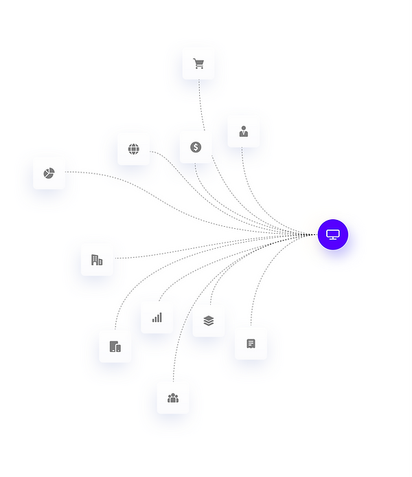
The high-level flow shows how the product connects different usage paths within the same portal environment, depending on account type, business complexity, and the task the user needs to complete.


USER 1
Enterprise account admin
A clearer starting point for complex account management
The Enterprise Dashboard was designed to give business users a practical overview they could start working from. Instead of forcing them to move between different areas just to understand what is happening, it brings billing, orders, cases, organizational units, and services into one view, making it easier to see what needs attention and where to act next.


The first widget users encounter gives them both orientation and momentum: clear account context on one side, and the most immediate actions on the other. This helps turn the dashboard into a working starting point, not just an information layer.
Together, billing, orders, and cases turn the dashboard from a passive summary into a practical decision-making surface.
By bringing financial status, operational progress, and open issues into one clear overview, the screen reduces the need to scan across multiple areas just to understand what is happening.
This helps users quickly see what requires attention, where things stand, and what to do next, especially in more complex business accounts where clarity is critical to moving from understanding to action.


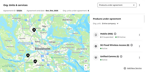
This view helps users understand how services are distributed across the business, rather than seeing the account as one flat list of products.
By mapping active services across sites and organizational units, it turns structural complexity into something users can read, navigate, and act on. Filtering by organizational unit or entity type makes it easier to move from a broad account view to a more focused operational one without losing context.
By capturing recent activity across the account, this timeline helps users follow what has already happened and what may still require follow-up. In environments where multiple actions can unfold in parallel, it becomes easier to trace progress, reconnect decisions to outcomes, and avoid relying on memory or external confirmation to understand where things stand.

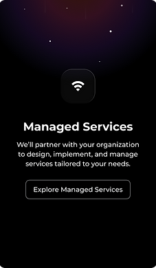
Beyond day-to-day account management, the dashboard can also surface relevant growth opportunities within the same account context.
This creates value on both sides: a more complete experience for the customer, and a more contextual business touchpoint for the provider.
Opened directly from search, the subscription details modal reduces the friction of moving from account-level visibility to subscription-level understanding. It lets users investigate a specific line in place, with access to details such as usage, charges, cases, orders, and troubleshooting, without leaving the broader account context.


A clearer way to navigate account structure
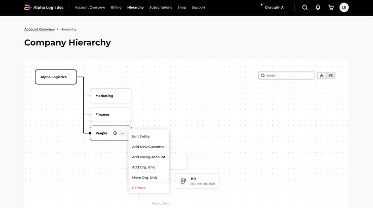
The hierarchy flow was built around the idea that, in complex enterprise accounts, users should not only be able to see the account structure, but use it as a way of working. Rather than navigating through disconnected lists or figuring out the organization on their own, the screen turns the company structure into a live map that users can read, explore, and act through.
Once users identify the relevant unit, they can act on it directly through a contextual menu.
Actions like adding a new Org Unit, adding a Billing Account, editing the entity, or changing its position happen from the right place in the structure, turning the hierarchy from a map into a management tool.
The modal captures the details required to create the new organizational unit before placing it under the selected parent entity.

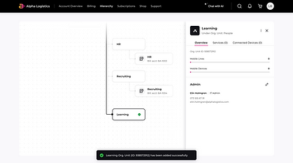

The newly created unit appears immediately within the hierarchy, with a side panel that surfaces its key details, such as admin ownership, linked services, and connected devices. This makes the change visible not just at the structural level, but as a new operational entity within the account
From structure to day-to-day management
While the broader hierarchy makes the account structure visible, the Org. Unit Overview turns a single unit into a focused working context. By bringing together the unit’s role, ownership, services, subscriptions, billing, and ongoing activity, the user can easily understand what belongs to that unit and what can be managed from there. Instead of piecing that meaning together across separate areas, users can move from structure to action with much clearer context.

Turning repetitive work into one guided flow
The bulk process turns large-scale subscription creation into a guided flow that is easier to manage and review.
Instead of repeating the same setup action one line at a time, users move through a staged process that lets them configure multiple subscriptions more efficiently, with summaries along the way and a final review before submission.
This translates an enterprise-scale task into a clearer, more manageable flow with review points throughout and a final summary before submit.


A clearer financial layer
The Billing Overview turns billing from something hard to interpret into something users can understand and act on.
Instead of showing only a final amount or sending users into reports and invoices, it brings the current balance, cost breakdown, trends, and details by service and organizational unit into one place.
For business users, especially in more complex environments, this creates the financial transparency, control, and decision-making support they need without relying on other systems or human support to interpret the picture.


USER 2
SoHo account admin
A simpler working view for everyday account management
The SoHo Dashboard was designed for smaller business accounts that need speed, clarity, and direct access to routine tasks rather than deeper structural management. Instead of emphasizing organizational hierarchy, it brings billing, shared usage, products and services, recent activity, orders, and cases into one practical view, making it easier to understand what is happening in the account and act on it quickly. This creates a lighter experience built around everyday management, with enough visibility to support action without introducing unnecessary complexity.

Reducing friction in routine account actions
Designed for smaller business accounts, this flow makes subscription creation feel more direct and manageable. Rather than forcing users to piece the setup together on their own, it guides them through the key steps in a clear sequence, from plan and device selection to assignment, SIM setup, and final review. The sticky footer keeps pricing visible throughout the process, helping users stay oriented and understand the cost as their choices take shape. Together with the final summary step, this creates a more confident and self-managed experience for completing a routine account action.
